Why Good Software Feels Like It Heard You
Game designers call it juice. Product teams should call it proof. The best interface feedback is not decoration. It answers one of four questions: did the system hear me, what is happening, did it work, and what can I do next.
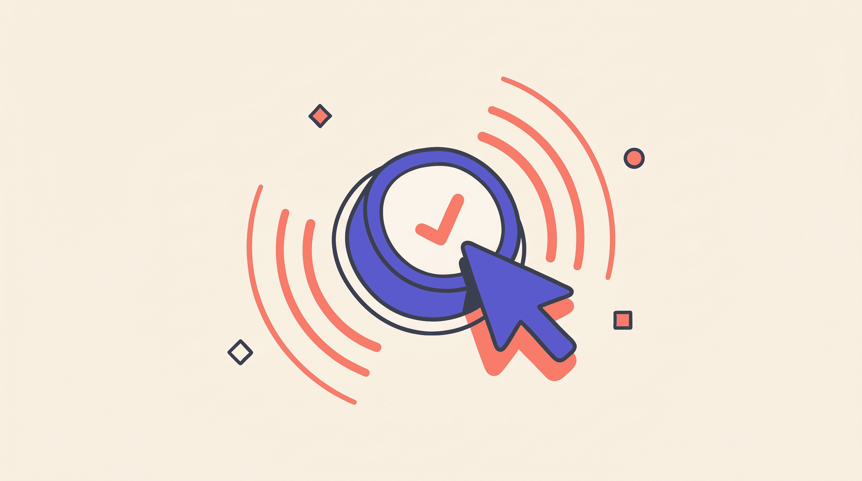
Game designers call it "juice" (Juice It or Lose It). Product teams should call it proof. That's exactly what good software implicitly does. Good software gives you proof. You tap something, and the button answers before doubt has time to form. The button compresses. The label changes. A tiny checkmark appears. The page holds its place. Nothing theatrical happens. You just know the system heard you.
That feeling has a name in game design: juice.
The term spread after Martin Jonasson and Petri Purho's 2012 GDC Europe talk, "Juice It or Lose It". They took a plain brick-breaker game and made it feel dramatically better by adding particles, sound, movement, and feedback while leaving the core mechanic alone. Same game. Better feel.
Steve Swink had already given the field a more formal frame in Game Feel: the sensation of control comes from real-time input, a simulated space, and polish that emphasizes interaction. The useful product lesson is narrower: people judge software partly by how clearly it responds to their intent.
The Best Polish Behaves Like Feedback
"Juice" sounds like decoration, which is why teams often overdo it. They add confetti. They animate every transition. They make dashboards bounce. They treat motion as a brand asset rather than a user signal. The better rule is colder: every bit of feedback should answer 1 of 4 questions.
- Did the system hear me?
- What's happening now?
- Did it work?
- What can I do next?
If an effect doesn't answer one of those, it probably belongs in the cut pile.
This is where product taste starts to look less mysterious. Taste means proportion. A button press deserves a tiny cue. A completed payment deserves a stronger one. A once-a-year milestone might earn celebration. A frequent interaction, like toggling filters or scrolling a feed, should stay quiet.
Apple's Human Interface Guidelines on feedback say feedback helps people understand what's happening, what they can do next, and what happened after an action. Apple's motion guidance also says apps should generally avoid extra motion on interactions that happen often. Android's haptics design principles make the same point with touch: frequent events should feel subtle, while more important events can use stronger feedback.
Good feedback has restraint built in.
The Invisible Patterns That Feel Right
Product building starts with the boring stuff.
- A primary button should acknowledge the tap immediately.
- An async action should move through clear states: idle, pressed, pending, success, error.
- A list-to-detail transition should preserve the user's sense of place.
- A search result should show what changed.
- An error should show recovery, not just blame.
- A completion moment should confirm success without turning every task into a birthday party.
The highest-return patterns are rarely the flashiest. They're the cues that remove uncertainty from common flows: save, send, upload, checkout, search, refresh, add to cart, invite, publish.
For AI products, this becomes even more important. AI systems do a lot of invisible work. They retrieve files, call tools, write drafts, check sources, update state, and fail in ways users can't see. A blank spinner is weak evidence. So is a chatbot that says it's working without showing what changed.
The best AI products won't feel magical because they hide the machinery. They'll feel trustworthy because they expose just enough of it.
The Confetti Tax
Celebration is useful when it marks a real milestone. It gets annoying when it fires on routine behavior. That's the confetti tax: the hidden cost of turning every success into a performance. The user pays in attention. The product pays in trust.
Folmer Kelly's counter-talk, "Don't Juice It or Lose It", made the point from the game side: polish can break immersion when it ignores context. In product work, the same mistake looks like feedback that makes the interface feel needy.
- A bank transfer shouldn't bounce like a slot machine.
- A healthcare portal shouldn't celebrate a lab result upload with fireworks.
- A developer tool shouldn't vibrate on every keystroke.
The question is not "Does this feel delightful?" The better question is "Does this make the user more certain?"
Measure The Feel
Game designers learned this a long time ago: an action feels better when the world reacts.
Product teams should borrow the idea without importing the excess.
Start with proof. Give every meaningful action an immediate acknowledgement. Show progress when work takes time. Make success and error states unmistakable. Preserve the user's place. Respect reduced motion. Measure the result.
The goal is a product that feels causally honest: the user acts, the system responds, and no one has to wonder what just happened.
That's the whole test.
- Did the system hear me?
- What's happening now?
- Did it work?
- What can I do next?
Answer those quietly, and the interface will feel better before anyone can explain why.
References
Android Developers, Haptics Design Principles.
Apple Developer Documentation, Feedback.
Apple Developer Documentation, Motion.
GDC Vault, Juice It Or Lose It.
Material Design 3, Transitions.
Microsoft Research, STEDII Properties Of A Good Metric.
Steve Swink, Game Feel, Chapter 1 Excerpt.
W3C WAI, Animation From Interactions.
web.dev, Web Vitals.
Share
Read Next
See all
Echo
Two Markets, One Vendor
Together AI's $800 million Series C confirms open-source inference on neoclouds has become a revenue-scale market running parallel to the closed-frontier labs.
Echo
Nineteen Days
Anthropic redeployed Fable 5 after a 19-day export suspension and disclosed that every frontier model it tested could produce the same vulnerabilities.

Echo
Science Ships
Anthropic shipped Claude Science and OpenAI published GeneBench-Pro on the same day, and science graduated from an AI use case to a product category at both labs.