Claude Design: Best AI Design Tool Ever?
TL;DR
Claude Design’s wireframing felt genuinely best-in-class — Greg was “blown away” by the product-manager-style questionnaire and the three app directions it generated for “Senior Brains,” including thoughtful details like caregiver visibility, accessibility for seniors, and mascot tone.
Starting with low-fi saves tokens and sharpens thinking — instead of one-shotting a full product, Greg deliberately began with low-fidelity wireframes for an iPhone app, arguing that constraints help founders decide features before spending a ton of Claude usage.
The deck generator was the biggest surprise — when he pivoted to a Sequoia-style $2 million seed deck, Claude Design produced what Greg called “the best deck I have ever seen created by any LLM,” complete with a 58 million Americans over 65 market angle, LTV/CAC math, and speaker notes.
The tool feels powerful but fragile in real use — the livestream exposed the stuff polished tutorials hide: errors, confusing navigation, lost questionnaires, unclear presentation modes, and the fact that trying to run two tasks at once seemed to freeze or interrupt progress.
Hi-fi UI output was strong enough to exceed expectations — after selecting direction A from the chat vote, Claude turned it into a polished app concept with onboarding, streaks, family encouragement, and even a useful “share this win on Facebook” CTA added from a rough annotation.
Video is where Claude Design clearly fell off — Greg rated the video capability “a five on 10 at best,” saying the ad output was okay but nowhere near tools like the Sora-like examples he compared against, and concluded it’s great for wireframes, decks, and visual design, not video.
The Breakdown
A live, unfiltered test instead of a polished tutorial
Greg opens by making the point of the stream explicit: this is not a cleaned-up product demo, it’s him getting his hands dirty with Claude Design in real time. He wants to see whether it’s actually worth the hype for creating a video, slide deck, website, or app — with the bugs and awkward moments left in.
Turning a startup idea into a senior-friendly app concept
He grabs an app idea from Idea Browser — personalized brain exercises for seniors — and names it “Senior Brains.” Instead of one-shotting a polished interface, he starts with a low-fi iPhone wireframe because, in his words, that helps avoid wasting tokens and acts more like a real founder figuring out what should exist.
The questionnaire that felt like a product manager
This is the first moment he’s visibly impressed: Claude Design asks smart follow-up questions about mascot vibe, accessibility, caregiver presence, exercise types, and screen choices. Greg keeps reacting to how unusually good the prompts are, saying it feels like the tool is extrapolating from the brief “like a product manager,” not just filling in blanks.
Three directions, agency-style, and a surprisingly good first pass
Claude generates three concepts — “warm and friendly,” “mascot forward,” and “calendar ritual first” — and Greg immediately compares the experience to working with an agency that presents multiple creative directions. He likes how each path has its own story: one is Duolingo-adjacent but calmer, another leans into the mascot Bean, and the third feels more like “morning coffee and crossword vibes.”
The first real friction: errors, retries, and task confusion
When he asks Claude to turn the chosen direction into hi-fi, the tool breaks. Greg lingers on this because it’s the exact stuff that gets edited out of slick AI videos: retries fail, debugging is murky, and community chat tips become part of the workflow. He also discovers the hard way that trying to run a deck project and a design project at the same time seems to interfere with both.
The deck generator absolutely steals the show
While design is stuck, he asks Claude Design to make a Sequoia-style deck to raise $2 million for Senior Brains — and the result floors him. It produces a sharp narrative around the 58 million Americans over 65, a “mom is the user, daughter is the buyer” framing, CAC/LTV estimates like $62 CAC and $228 year-one LTV, and speaker notes; Greg calls it the best deck he’s seen from any LLM, period.
Hi-fi design finally lands — and the annotation workflow works
Once the app screens appear, his mood swings back up fast: the onboarding, home screen, progress views, and family-social touches all look polished and warm. He tests the feedback loop by sketching in a note to add a Facebook sharing button, and Claude comes back with “Share this win on Facebook” — a small copy choice Greg loves because it feels conversion-aware rather than generic.
Video generation proves the limit of the tool
He finishes by trying to turn the app into a 30-second ad aimed at 35-45-year-old adult children, and this is where Claude Design stops feeling best-in-class. The questionnaire flow is clunky, context gets lost when switching projects, and the resulting ad is, in Greg’s blunt summary, “better but it sucks” — enough to make his final verdict clear: incredible for wireframes, strong for polished visuals and decks, but not the tool he’d choose for video.
Was This Useful?
Share
Keep Reading
Make Alcreon Yours
Tune your feedFive quick questions, and the feed ranks what matters to you first.Or just get notified
The weekly Echo. Signal worth keeping in your inbox.
Every new piece, announced on X.
Read Next
See all
Playbook
Tasteful Skills
“Tasteful Skills” argues that the best agent skills are not documentation or best-practice lists.
Playbook
The Art of Tasteful Prompting
Learn how tasteful prompting helps you move beyond generic AI output by shaping context, style, and judgment from the start.
Playbook
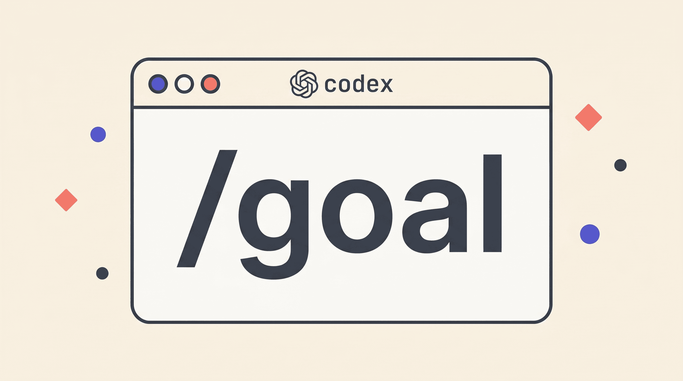
The Codex /goal Playbook
OpenAI shipped /goal for the Codex CLI. It turns a prompt into a persisted, self-continuing contract.